
The making of...

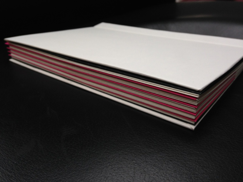
I decided that the artwork needed to somehow frame the writing. I wanted french folded dividers, so the art from the inside was visible on the outside, at the edges of the page, and made a patter down the edge of the book. I made a little hardback mockup, placing some pink envelopes in to see what coloured dividers would look like. A promising start. Now for some art.
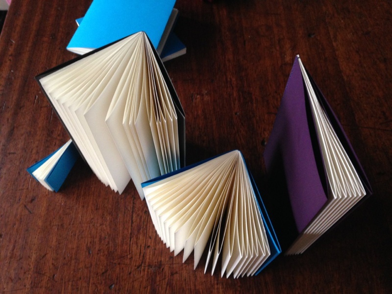
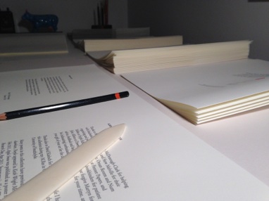
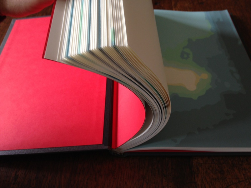
In December, I was playing with french folded books, where the reading surface is a folded sheet. I loved the feel of the pages, especially the creased edges, the way the paper has extra weight, and the way the light catches the folds. I made some small mockups on my Singer sewing machine. At the same time as trying out page sizes, and paper flexibility, I was thinking about how to mix artwork with Mary’s writing.
I spoke to Ornan Rotem and Num Stibbe at Sylph Editions, Tony at Fenner paper, lots of printers, Cameron bookbinders, to get ideas and a better understanding of the process. On the way back from leafing through some of Sylph’s amazing books, I closed my eyes, and saw a dark grey book, with red end papers, rounded folds, and a debossed cover. I set out to try to make it. I couldn’t find a way to create a binding that would do what I wanted.
I made a mockup using Japanese binding (see below). It worked fine, but the pages didn’t open elegantly the way I wanted them to. I wanted them to open FLAT. I talked to lots and lots of people, and eventually came up with a solution thanks to Downie Allison Downie bookbinders: overstitched bound, like University Journals. Turns out there are only a couple of overstitching machines in the UK, but thankfully there is one in Glasgow! Then, the challenge became protecting the beautiful folds from presses, guillotines, stacking, trimming, warping, so they could open like the little books I made with my Singer, but in a hard cover.
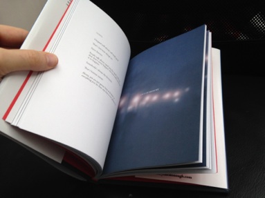
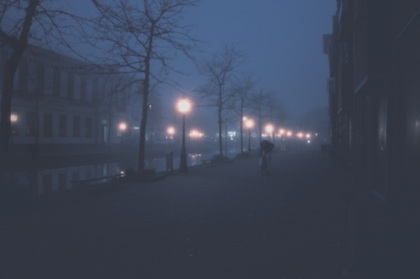
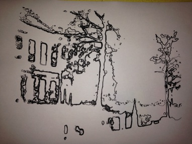
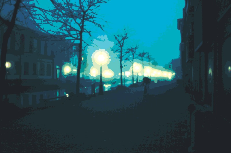
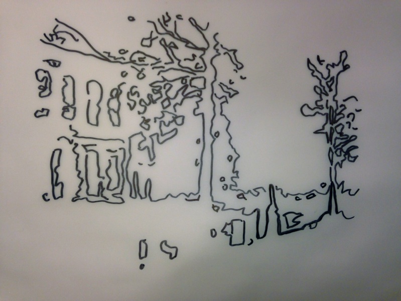
I’d already decided on an image to work from – this photo I took along a canal in Leiden in the Netherlands in 2007. The atmosphere just seemed to fit Mary’s theme of loss and decay, and the sense of not quite being able to work out what was going on in the photo. I loved the way the image got lost in the distance, the cyclist by the canal, the light. I wanted somehow to replicate the experience of loss of awareness in artwork. An image that somehow can’t be seen in totality; always degraded in some way, but somehow familiar.
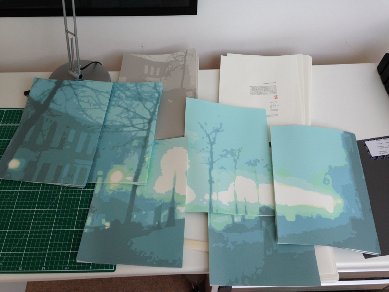
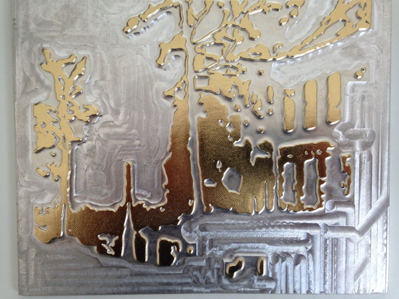
For the fine art edition, I wanted something with more subtlety in the colours, maybe something I could silk screen or pigment print. This was the final version of the artwork that I settled for. To me it captured the subtle loss in the picture. Degraded but not impossible to read. I decided to divide this image between all of the sections, and have the full picture at the beginning and end of the book, like a bookend to the experience, but in grey.
I tried a couple of mockups using the photo directly in sections, but something was missing; it was too easy to read emotionally. Not quite disorienting enough. I wanted people to not quite be able to work out what the art was about. To sense that they had an idea, but not be sure. I needed to try some ideas out.
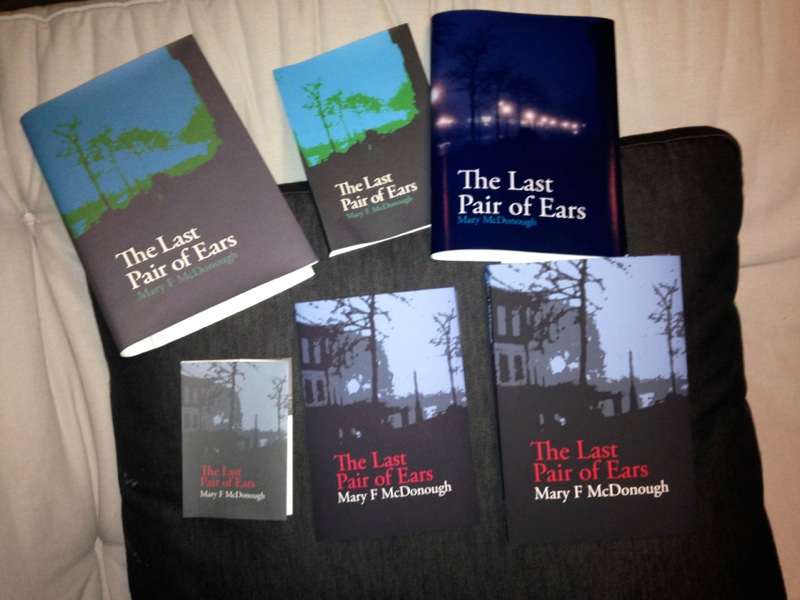
I played with lots of different concepts for the cover of commercial edition, ending up with a block colour illustration that I was happy with (bottom right).
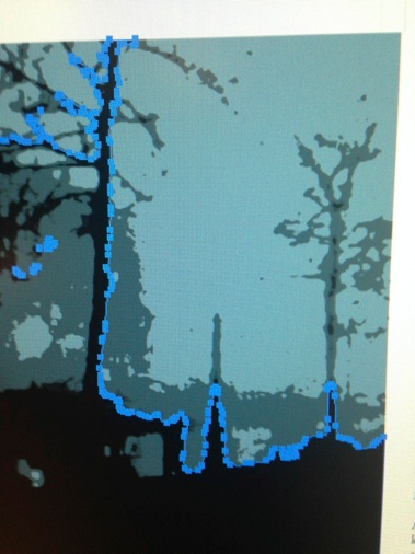
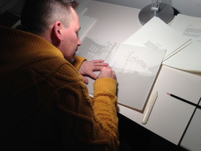
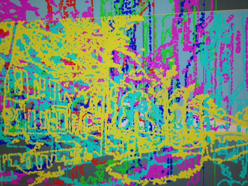
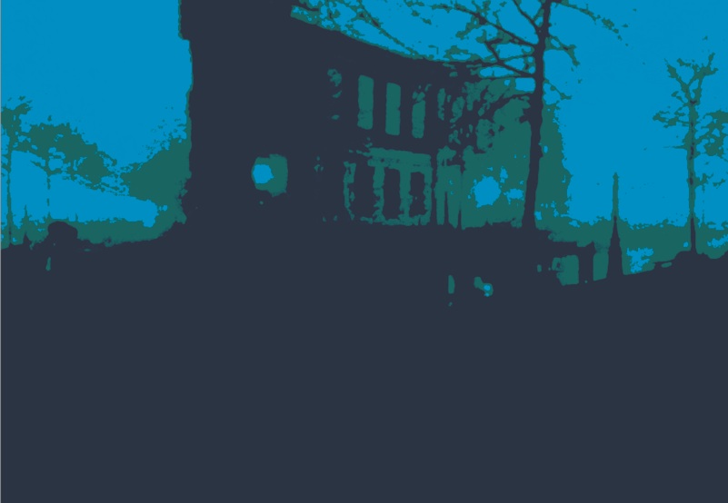
I cleaned up the image by hand, adjusting all of the points, and curves to get beautiful abstract shapes and tones.
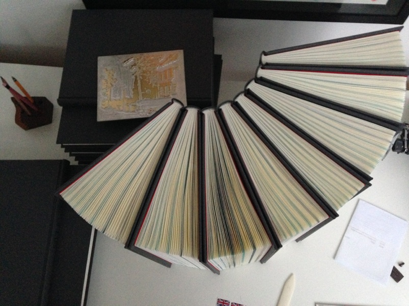
And then created different layers and subsections of the image for each of the different dividers, trying to tell the story of the image across all of the dividers, and having the image only viewable in full in the grey top and tail dividers. I then colour balanced the images, printing hundreds of colour variations until I got the one that looked best with the paper, and had the unique feel I wanted.
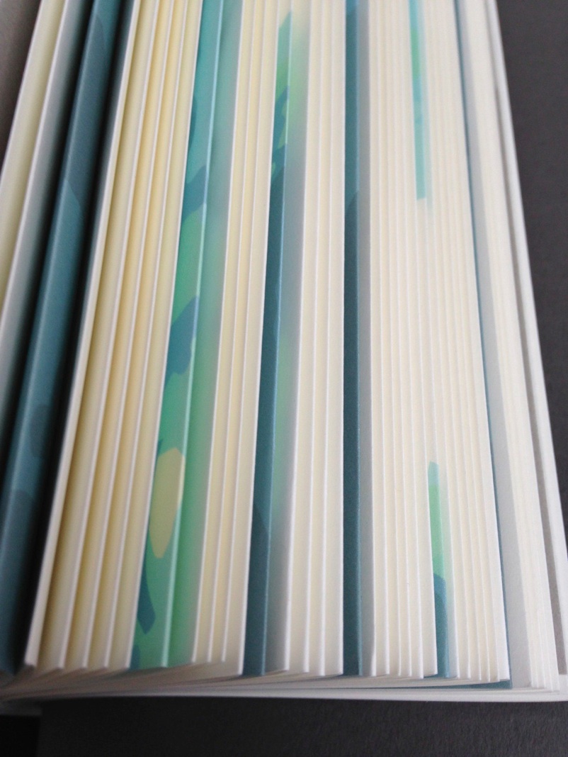
Here’s the relationship between the dividers and the original artwork. Pretty cool to see them laid out beside each other! I wanted a tone that would fit with the content, but also that would be set off by the red end papers. Low contrast, but enough to hold their own on a page spread.
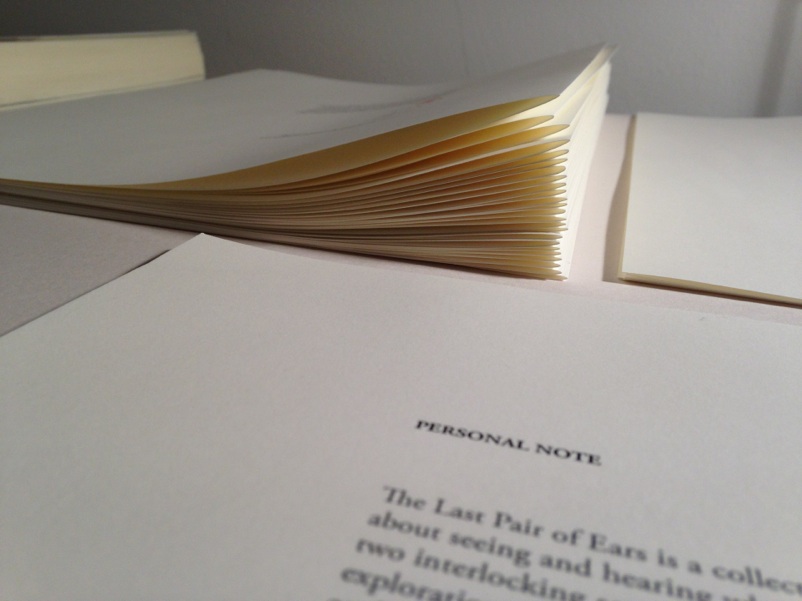
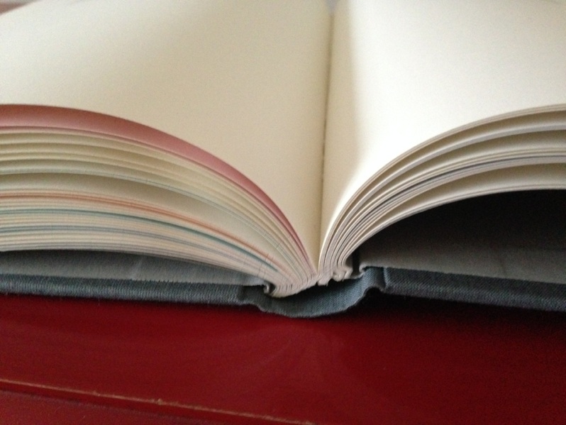
The whole concept of the book was to have an experience of paper being alive, of a book that wanted to be OPEN, words jumping off the page. I love french folds, and the cushioning that the air gives them when the folds flop onto each other. I wanted to capture the thick, chunky feel of the 120gsm paper in a hardback experience. to feel like the book was working with me somehow as a reader. The challenge here was to fold the sheets with just the right amount of pressure. Too much, and the grain of the paper would be crushed, and it would lose its bounce. Too little, and the fold wouldn’t be clean.
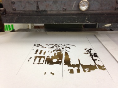
I printed all of the dividers myself, hand-folding them gently so I didn’t remove any of the ink from the edges, nor leave them too tightly folded. I had chosen the paper because it folds beautifully, and is acid free, so won’t discolour over time. That, and it feels fantastic and is from sustinable forest.
I got pretty good at folding with the right pressure. Turns out that 30 books of 44 folds is 1320 folds! It took me about a week of printing and folding. All of the pages are printed in 100-year pigment ink, so it should last for 100 years of light exposure.
There’s something beautiful about the rhythm of moving paper from one pile to another, folding, turning, shaping the edge, trying to fold the paper without crushing the springiness out of it. And seeing them all neatly arranged in stacks.
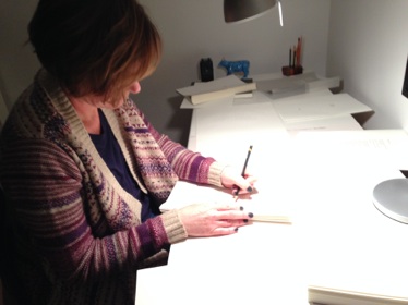
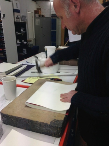
Here’s Mary signing the books.
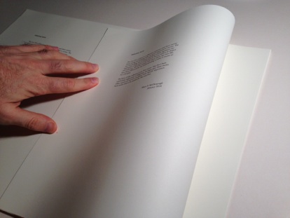
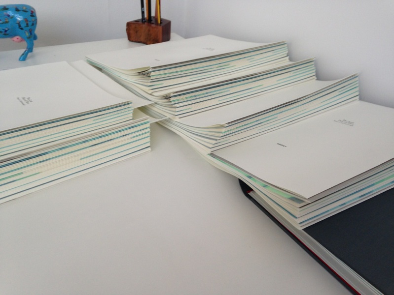
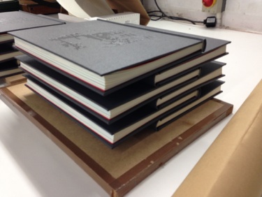
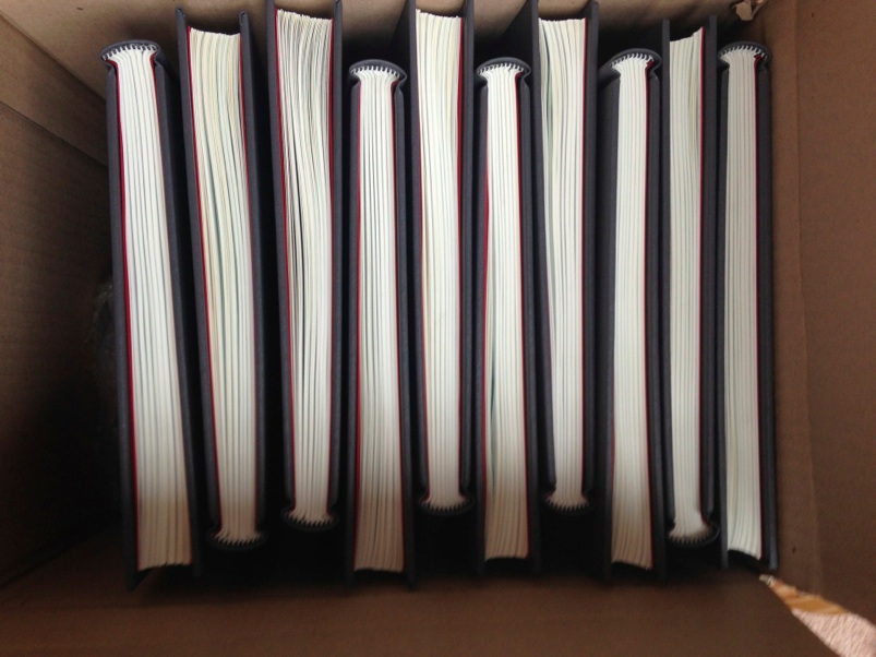
The final stage before taking them to the binders: collating the pages. I don’t think I made any mistakes. They’ve all been checked loads of times, but without page numbers, it’s all harder. I was glad that the divider art looked so beautiful from the edge when I put them all together. Amazing randomness, though I carefully selected contrasting areas of the image for dividers, so it’s not completely random!
We decided that the book should feel like a journey. No page numbers. Just the experience of dipping in and out, feeling your way. Slightly disorientated, but enough reference points to keep it interesting, to keep some sense of the journey.
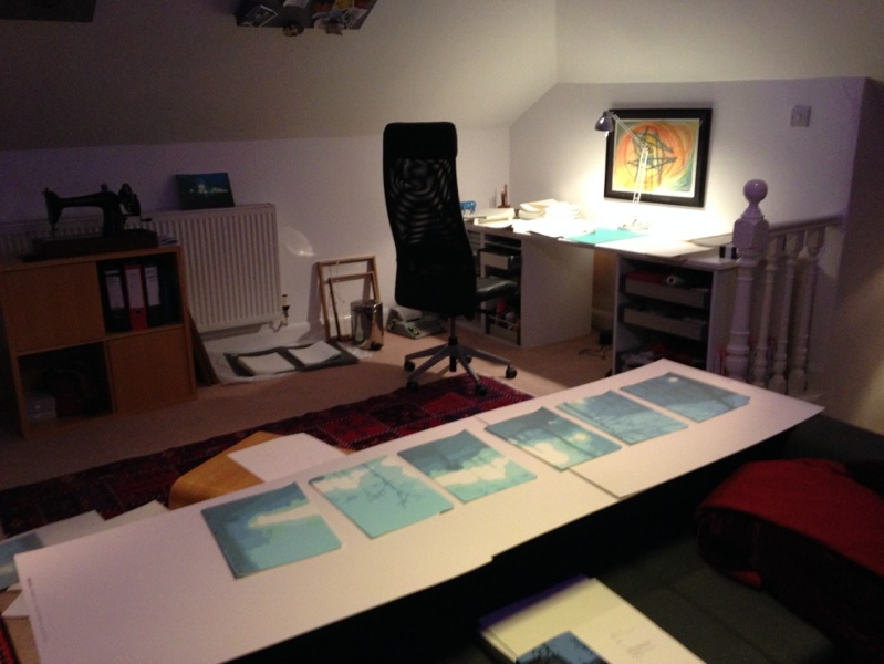
It’s not easy keeping stacks of loose paper organised!!
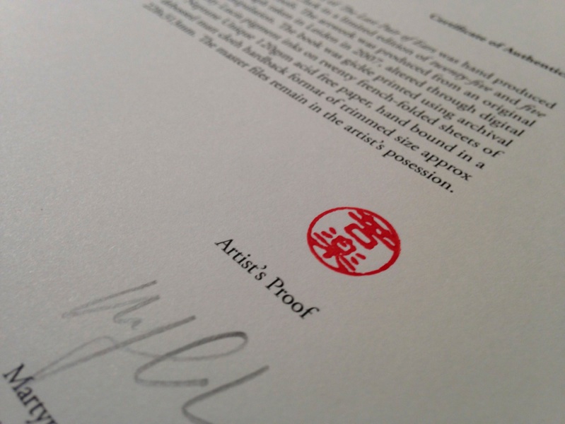
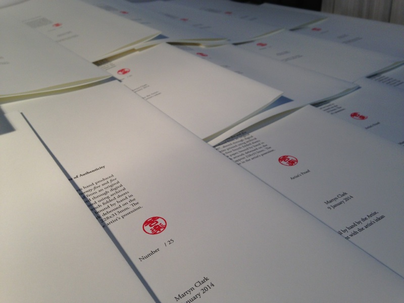
Here are the certificates drying after stamping. I had to reprint them three times before I got all of the specifications right. The book size and design were all changing up to the moment I handed them over to the binders.
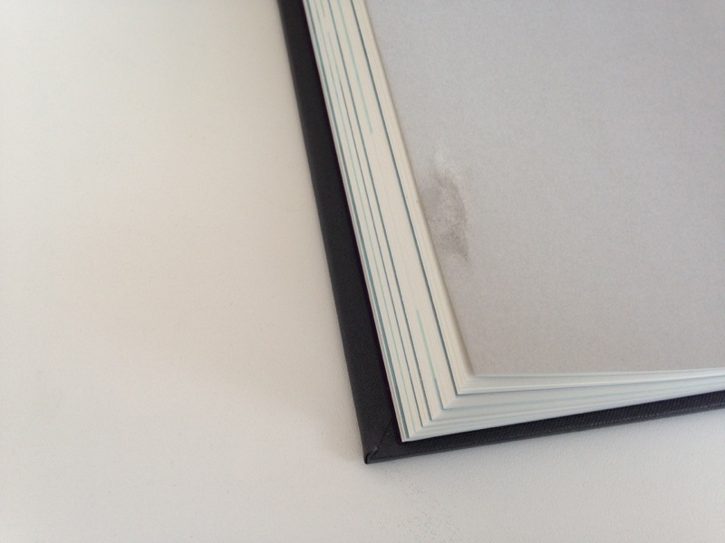
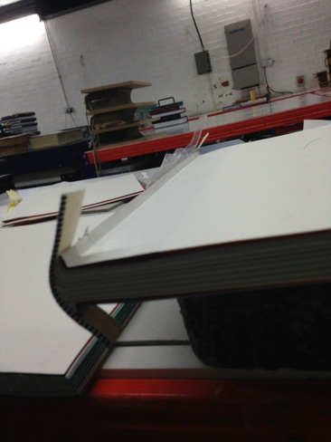
Now that all the content was finished, the next stage was binding. It turns out that binding french folds isn’t easy. They’re usually just glued, but I wanted a book that would last. I worked closely with John Allison at DAD to design an overstitched binding with hinged spine.
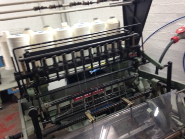
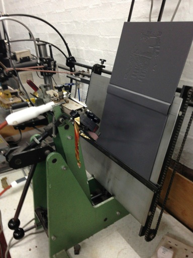
Here’s the overstitching machine. It’s crazy watching it work.
Before finalising the design of the binding, John did a stitched mockup. Making a buckram-bound hardback involves pressing the book in a pneumatic press. This had the unfortunate side-effect of crushing the edges of the folds. They lost their spring. And the colour came off the edges, so the divider concept didn’t work any more. So we had to redesign the spine, using cloth hinges so that the cover could be pressed separately, and the spine pressed in a manual press. John wasn’t too happy about the extra work!
Binding designed, the paper was stitched, then trimmed. The trim size ended up having to be slightly smaller than I anticipated, so the spec on the certificate still isn’t right; it’s a couple of millimetres out. Just like everything else in this project, the trimming involved careful negotiation; not to crush the edges, not to have the stack flop sideways too much & end up with books that aren’t symmetrical. It’s hard work doing something new.
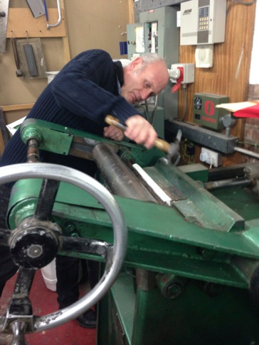
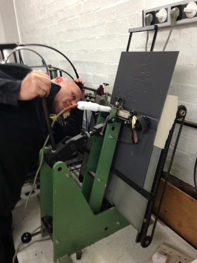
After stitching, comes gluing the spine, then hammering it into a curve.
Here’s John hammering. And a video below, so you can hear the amazing sound of hammer on paper:
Then rolling them. Rolling makes a pretty cool sound too; here’s the video:
And testing the headbands. The book blocks are now ready for endpapers and hinges.
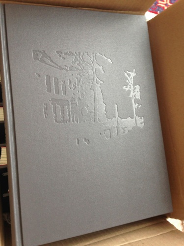
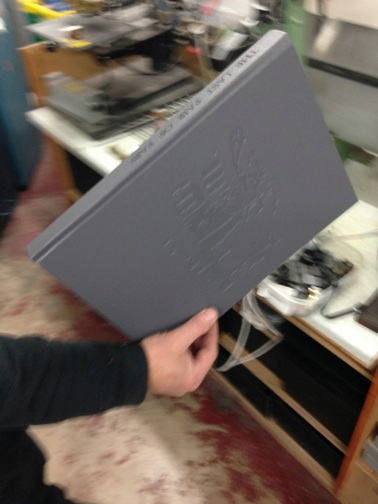
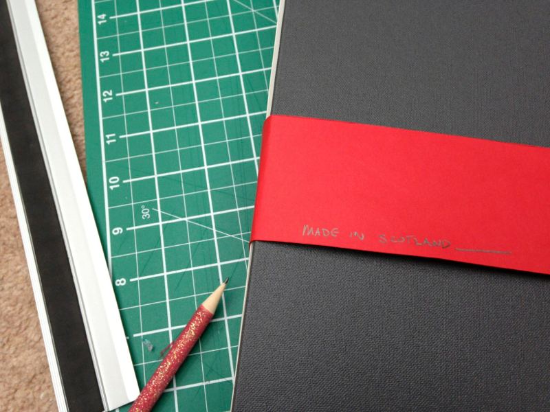
While all that was happening, I was busy designing the cover. I wanted the cover to be tactile, so there was a sensory version of the image. I thought I’d like a smooth cloth with debossing, but ended up favouring Buckram. It’s more solid, more substantive. Seemed to fit the contents better. To create the artwork, I started with the commercial edition cover...
...and edited it down by hand to get the minimum needed to create a sense of the place. Just enough to look like something, but not quite enough to be obvious!
For some reason the computer editing just wasn’t working. I got a piece of tracing paper out and scribbled to highlight the lines that seemed important to capture. A few days later, after lots of editing in Adobe Illustrator, I had a template for the die.
And a few weeks later, I had a computer-cut aluminium die (with the artwork reversed, of course) to press the covers.
Here’s the first die test, used to line up the covers for pressing. Looking good.
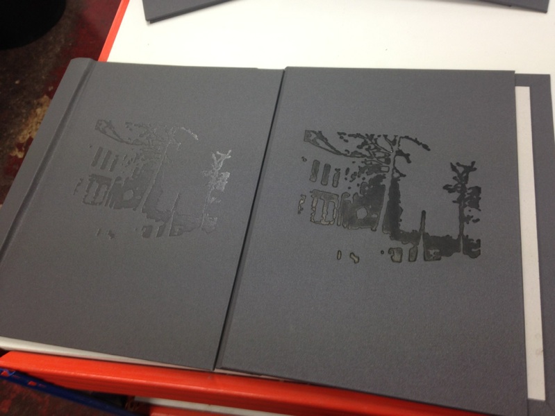
Then came deciding what colour to press it with. We tried black, grey, shiny, red, silver, speckly, dusty black, reversed and blank. The reversed (using the foil backwards to get a smooth finish) seemed to work best. Subtle but if pressed deep enough, creating a really beautiful contrast between the buckram and the debossing.
Next, the spine text. I had made up a die for the spine, but wanted to test what foil colours to use before committing to the front die colour (yes, I like to see how things will work). John made up a stock font for the spine (in Edinburgh font), and I liked it so much I scrapped my text design for the spine. It’s a beautiful old-world, really unique font.
It’s not a simple process lining up the spine text with such a big book.
The first test copy binding. Yay.
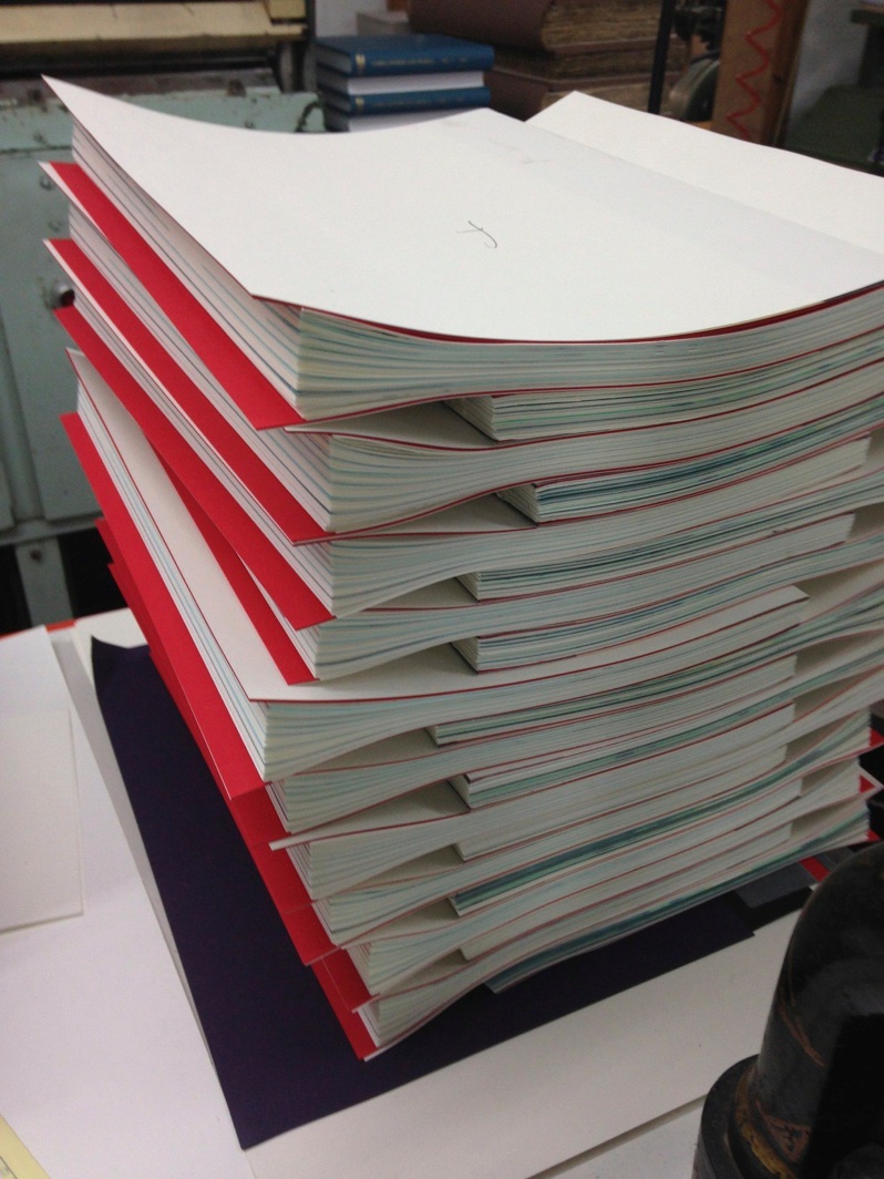
Waiting for the glue to dry after putting the book block in. Note the careful stacking to avoid crushing the edges of the folds.
Finally I get the books back to my studio.
But now there’s a final process. Uncrushing the pages. Stacking and trimming and pressing the spines has all crushed the folds slightly. I remembered that John had suggested unfolding the folds afterwards. With the hydraulic press, the paper was so crushed that the folds couldn’t be revived.
I tried it again, hoping that I could release the springiness, and it worked!!! I managed to keep the folds bouncy, and get them in a hard cover, with bright red end papers. Unfortunately I’d blown the budget completely.
So there I had it; 30 books, hand made, with folds intact, and the feel that I wanted. Sure, there were lots of compromises along the way. The stitching from oversewing isn’t perfect, the book sits strangely when it’s flat, but it definitely begs to be read, and that’s what I wanted.
Somehow I managed to design an exraverted book with introverted contents :o)
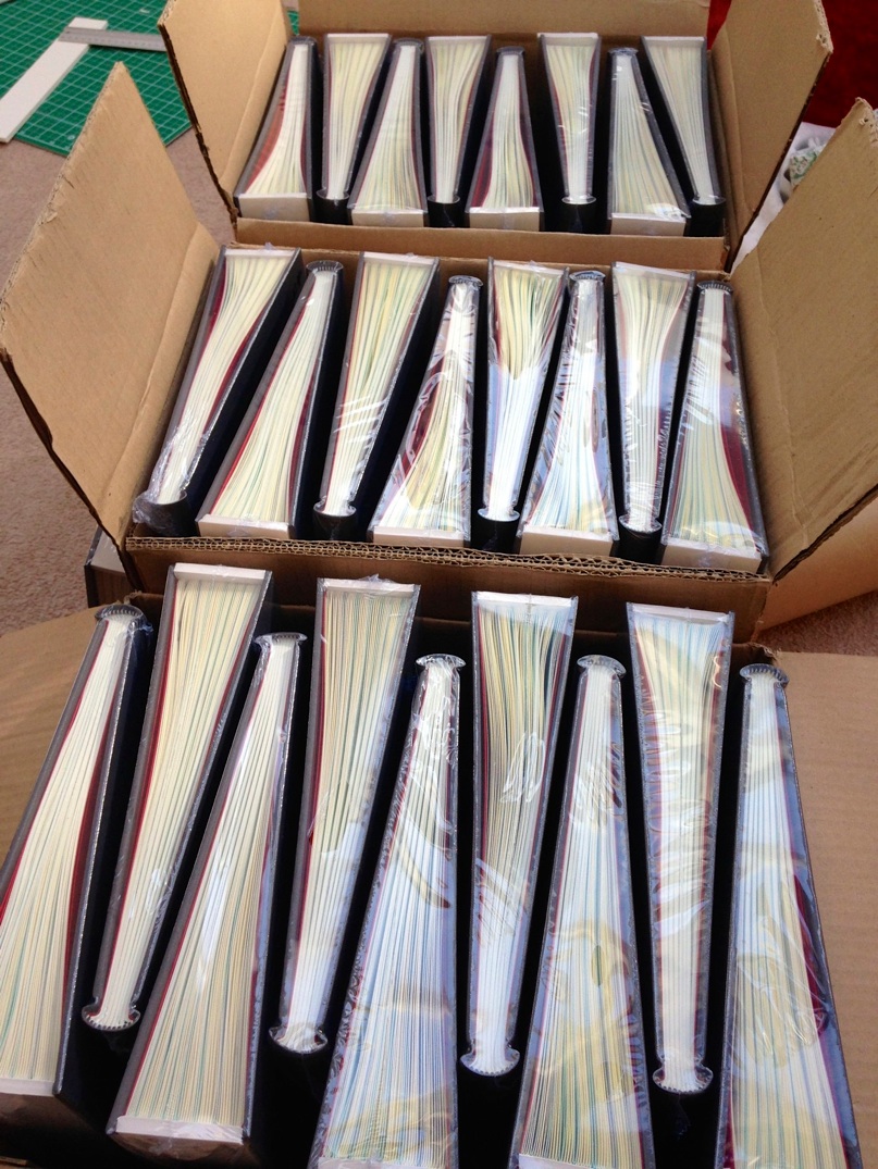
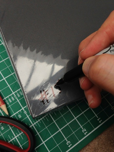
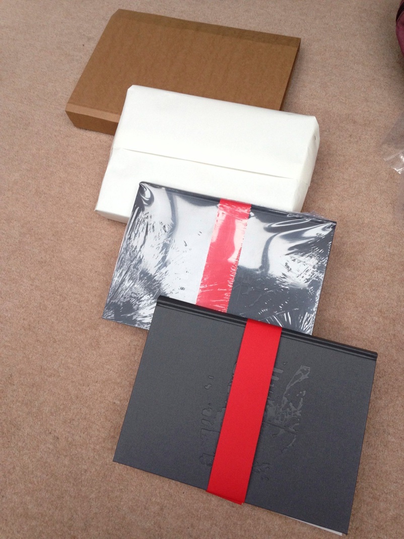
Turns out that wasn’t the end. There’s no way to just put a triangular book in a book wrap to post it. Not without risking the folds getting crushed. So I devised a method to shrink-wrap them with fold-protectors (TM – otherwise known as pieces of foam board :o).
I think shrink wrapping the books was probably the most fun part of the whole project! I was having so much fun, I almost forgot to keep track of the edition numbers in case people have a numerical preference.
For delivery, I’ll wrap them in some of the paper they were made with. Seems like the best possible wrapping paper.
So here they are. Ready to send to people. Need a Christmas idea for later this year?
One of my philosophies of making is that everything I make has an obvious flaw in it somewhere; it reminds me of my imperfection, of what it is to be human. It’s a philosophy borrowed from Islam, from Persian Carpets, and the notion that we, as humans, cannnot be perfect, no matter how hard we try.
Usually I get away with the flaws being not very noticeable to anyone but me. In one of the artist’s editions, the one I used to check the trimming size in the bookbinders, I picked up a ruler and didn’t notice it had glue on it. On the final divider section, there’s a massive gluey thumbprint that I couldn’t remove. If you’d like to buy that book, let me know, and name your price. It’s got an original thumbprint in it :o)
I’d estimate that, in total, each book took me over a day to create. I didn’t keep track of it; it would be way too scary from a return on investment perspective. It was an amazing process, really emergent, very innovative, and I’m really proud of the outcome, even with the thumbprint.
Making a book was a really scary new adventure for me (Martyn). I don’t read much, but I love paper and the experience of leafing through books. And I love design and typesetting too. I set out to create a book that I would want to handle, using Mary’s existential writing as inspiration. I wanted to create something that was a personal response to the power of Mary’s writing.